by Diane Rath of The Rath Project
SEPTEMBER 23 2018
Hello everyone, I’m Diane Rath. I was more than excited to write this post because I more than love Tempaper- I want to marry it- kidding! (kind of… ) Let’s just say that if my husband and every one of my clients would allow me to use it in every room, I probably would (you can see some of my previous projects in which I’ve used Tempaper here, here and here). Before I get further into that and the project that I’ve tackled this time, let me quickly introduce myself. I am an interior designer on the East coast of Connecticut who founded The Rath Project. We specialize in residential design and my projects always include color, a fun mix of patterns, a healthy dose of texture and funky art. I like to push my clients to live big through decorating, but I’m also a huge believer that you can get a high end look at a low cost. And my motto has always been to see a design “challenge” as an opportunity for creativity.
On that note, let’s talk about my current project: an investment property- that’s right, our very own “flip or flop!” My favorite type of project is one where I can tackle everything, soup to nuts. So, when we came across this house (located less than 10 minutes from our home) and saw its charm along with decades of work that needed to be done, we knew we had a fun one on our hands. After deciding on the big items first: opening up the first floor and moving the kitchen, turning it from a 5 bedroom 2 bath to a 4 bedroom 3 bath with a walk in closet, converting the scary attic into a playroom, and finishing out the basement enough to create a laundry room, storage room, maintenance room and rec room, I was able to really get started on the decor.
I knew before we even began demo that I wanted to use Tempaper in some way. Realizing that this property would most likely belong to another young family, I was hoping to give the new buyers a space with big personality that can evolve as they evolve. The graphic modern designs of the Novogratz paper was exactly what I had in mind, and the removability of Tempaper as a whole gives our audience options. Let’s face it, with any investment property, we have to keep in mind that not every single person who walks through that door will love every single finish that I pick since design is very personal- and therefore, having the ability to tell the buyers that the paper is removable, just in case, is a huge selling feature.
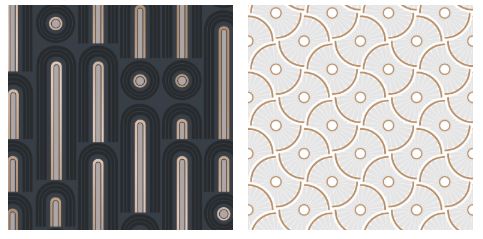
The first paper I used, Wave Pop, is one of my absolute favorite patterns that I‘ve spotted on the Tempaper site in a while! I’m really happy about their partnership with the Novogratz team since those hip graphics with a nod to the mid mod style are exactly what I gravitate towards. These patterns also take the traditional, classic designs that I like to bring into spaces into the “cool zone.” Aside from choosing a fun pattern, I decided that I wanted to add it to this home in an unexpected way.
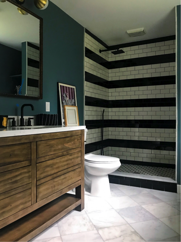
And since I decided to keep things minimal, fresh and mostly neutral in the rest of the master bedroom decor, a pop of personality was just what was needed. Also, now that we had created a true master suite, something that was previously missing from the home, I wanted the room to feel special and was looking for something to tie into the exciting tile work that we added to the master bath:
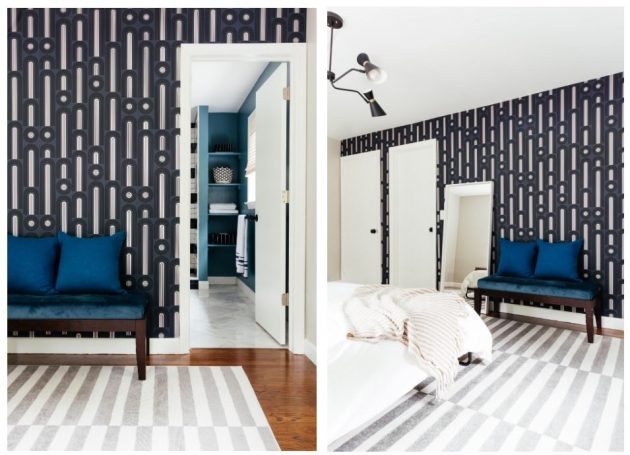
I created a focal wall across from the bed with the Wave Pop paper wrapping around the door frames, giving the space a true custom look. Now this is a master suite that the very lucky new homeowners will love waking up in! And here it is after:
In addition to the wallpaper in the bedroom, I decided from the outset that we MUST add a cool design in the kitchen/dining room that you’d see as soon as you stepped through the front door. And after moving the kitchen to other side, we freed up a lot of space in the new dining area. Below, you’ll see where the old kitchen was- yup that tiny little corner box that was closed off by walls was it! Here, we had already taken down one wall and we were preparing to get rid of the other.
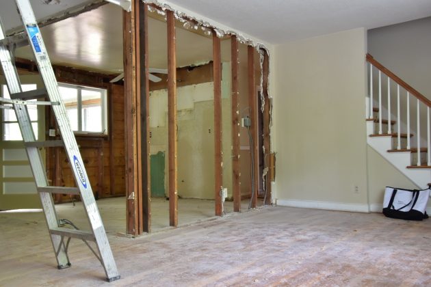
And this is the new kitchen and dining room under construction:
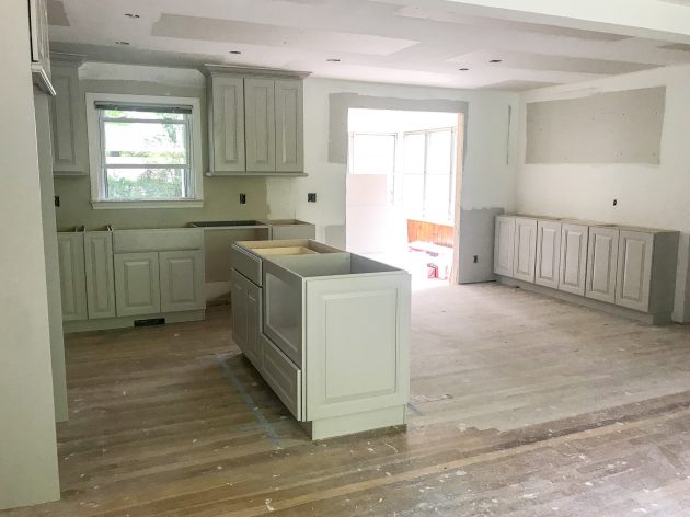
There was much push back from contractors, my realtor and even my family, who all told me not to bother with cabinetry on the dining room wall, but I had a vision, that included Tempaper, that I couldn’t let go of and man am I happy I stuck to my guns! I decided that adding matching cabinets, shelving and countertops would tie everything together as well as provide another customized focal wall (again, my goal was to give the new buyers great design instead of your typical builder grade product). And this is where Wheels by Novogratz for Tempaper came into play. Instead of plain old paint behind the open shelving, I felt a pattern would take it up a notch. And did it ever!
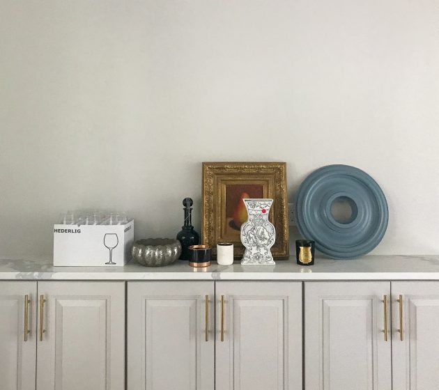
Here it is before the paper went up:
And here it is after:
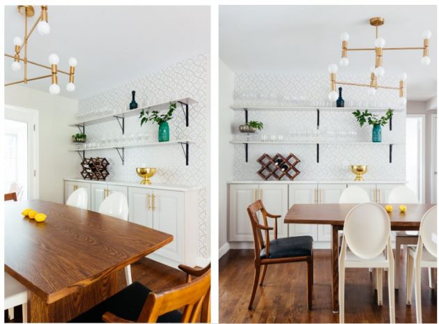
Look at how perfectly that paper works with the cabinets and the colors in the room. It provides a pop without taking away from everything else that’s going on- truly spectacular if you ask me!
Well, thanks for joining along in my Tempaper journey. I hope I inspired you to think outside the box and use your creative spirit to add a bit of whimsy to your home! If you’d like to see all the before and afters for this particular project, and read a bit more about my experience with the use of these two particular patterns, check out my blog: The Rath Project. I also love feedback so questions, comments and alternative ideas are always very welcome!
Love and Creativity,
Diane Rath

